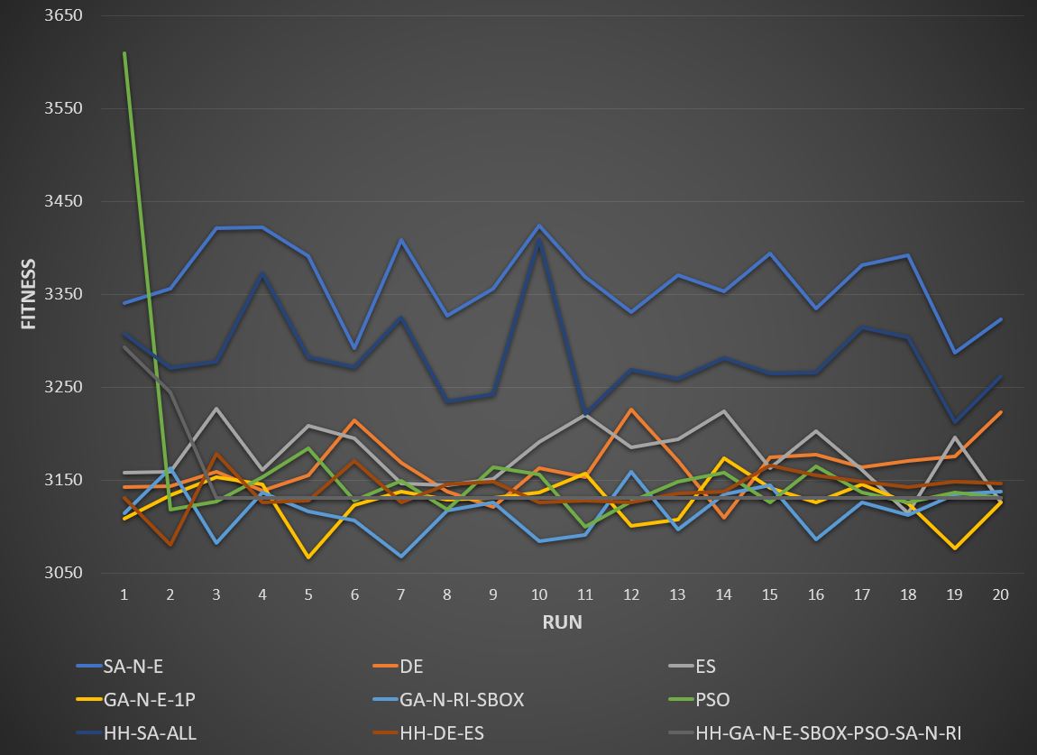
Working on a Python-based platform that made available a number of different optimizers (Particle Swarm, Genetic Evolution etc) at solving problems, I wanted to generate a clear, good looking and informative fitness trend chart I could embed in an academic report. Spent a few hour messing about with Python packages Matplotlib and Seaborn but wasn’t satisfied with the results.
Exported the trend data out of Python in .csv format and imported into Excel. 20 seconds later I had something I was really happy with (see below). A powerful reminder to focus on the end result and not on the tool. Excel, well, excels at stuff like this, and I have so much more to learn about it.
